Looking for a free GeneratePress sticky header?
I've noticed many WordPress themes lock the sticky header option behind their premium theme (Recently Astra). I guess we'll just have to suffer or pay up, right? Nope, not today! If there's one thing, I can't stand, it's watching newbies shell out for one small feature.
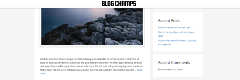
I've crafted 6 solutions (with live examples) that will do the trick and figured I'd share them with y'all. After all, the entire basis for my blog is to help WordPress beginners save money. Or at least make more informed decisions.
Don't get me wrong, GeneratePress is an awesome WordPress theme. I fully support it, but if you're only looking to create a sticky header, chances are you don't need their premium version.
In this guide, I will demonstrate how to enable a sticky header in both the free and premium versions of GeneratePress. There are 3 different methods for doing this:
- Using custom CSS (Cascading Style Sheets)
- Using 3rd-party plugins
- Using the Menu Plus GP Premium module
The first two methods are completely free but not as robust and flexible as the last method.
GeneratePress Sticky Header – Free
Method 1 – CSS
Because you don't need to install additional plugins, the CSS method is best used when speed impacts are a top priority. The CSS method has minimal performance impacts but is limited in control and flexibility.
CSS Solution 1 – Full Header
The first solution is pretty straightforward and is most suitable for short menus.
Step 1 – Set up Navigation Menu
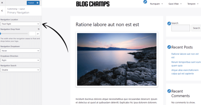
From the GeneratePress customizer menu, navigate to Layout > Primary Navigation, and select Float Right from the Navigation Location dropdown menu.
Step 2 – Locate Your Header Class
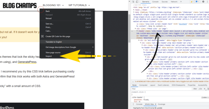
Locate your selector, which in this case is going to be the class name of your theme's header (usually .site-header).
To check this, right-click on your header and click Inspect, then look for your header's class name. Note that you might have to browse through the code a little bit to find the right header class.
You can also find it easily with this Chrome Extension.
Step 3 – Navigate to Additional CSS
From your WordPress dashboard, navigate to Appearance > Customize > Additional CSS.
Step 4 – Paste CSS Code
Paste this CSS code into the editor:
/*Make Header Sticky*/
.site-header /*header class*/
{
    position: fixed;
    top: 0;
    width: 100%;
    max-width: 100% !important;
    z-index: 9999!important;
}
/*Page Featured Image*/
.page-header-image
{
    padding-top:100px!important;
}
/*Adjust Desktop Padding*/
@media (min-width: 768px)
{
    .home,.single-post
    {
	margin-top: 100px;
    }
    /*Menu Styling*/
    .menu-item a
    {
        padding-top: 3px;
        padding-bottom: 3px;
    }
    .menu-item li a
    {
        padding-top: 5px!important;
    }
    .menu-item ul a
    {
        padding-bottom: 5px!important;
    }
}
/*Adjust Tablet Padding*/
@media (max-width: 768px)
{
    .home,.single-post
    {
	margin-top: 60px;
    }
    /*Menu Styling*/
    .menu-item a
    {
	font-size: 20px!important;
        padding-top: 3px;
        padding-bottom: 3px;
    }
    .menu-item li a
    {
        padding-top: 20px!important;
    }
    .menu-item ul a
    {
        padding-bottom: 20px!important;
    }
}
/*Adjust Mobile Padding*/
@media (max-width: 480px)
{
    .home,.single-post
    {
        margin-top: 60px;
    }
}
.site-header
This is our header class. You don't need max-width for GeneratePress. I've only included it because some themes don't have header container options. The z-index ensures that the header remains on top of all other content.
Note that when we stick the header, the content gets shifted upward. The solution for this is to use the padding-top property to bring it back down.
@media
Different devices may require different amounts of padding, so we use the @media query to target different screen sizes.
.home & .single-post & .archive
These are the padded content classes. I didn't use .site-content because it breaks the featured image design for pages.
.page-header-image
The free version of GeneratePress doesn't offer a way to add featured images inside page (not post) content, so the featured images for pages actually sit above the content.
If you only padded .site-content, it would miss this class AND add unwanted padding below the featured image, creating a large gap between the featured and the content. For this reason, it's better to target the homepage, single posts, archives, and pages separately.
.menu-item
This class is used to style the top-level and sub-level menus.
CSS Solution 2 – Full Header With Scrolling
While the above sticky header works well for short menus, the bottom portion of tall menus will be cut off. A quick fix for this is to make the sub-menus scrollable.
Add the following CSS to the tablet or mobile @media queries only (or prepare for some weird desktop menus).
.menu-item ul
 {
    height: 150px!important;
    overflow: scroll!important;
 }
In case you're still unsure, here is the full code for solution 2:
/*Make Header Sticky*/
.site-header /*header class*/
{
    position: fixed;
    top: 0;
    width: 100%;
    max-width: 100% !important;
    z-index: 9999!important;
}
/*Page Featured Image*/
.page-header-image
{
    padding-top:100px!important;
}
/*Adjust Desktop Padding*/
@media (min-width: 768px)
{
    .home,.single-post
    {
	margin-top: 100px;
    }
    /*Menu Styling*/
    .menu-item a
    {
        padding-top: 3px;
        padding-bottom: 3px;
    }
    .menu-item li a
    {
        padding-top: 5px!important;
    }
    .menu-item ul a
    {
        padding-bottom: 5px!important;
    }
    .menu-item ul
    {
        height: 150px!important;
        overflow: scroll!important;
    }
}
/*Adjust Tablet Padding*/
@media (max-width: 768px)
{
    .home,.single-post
    {
	margin-top: 60px;
    }
    /*Menu Styling*/
    .menu-item a
    {
	font-size: 20px!important;
        padding-top: 3px;
        padding-bottom: 3px;
    }
    .menu-item li a
    {
        padding-top: 20px!important;
    }
    .menu-item ul a
    {
        padding-bottom: 20px!important;
    }
}
/*Adjust Mobile Padding*/
@media (max-width: 480px)
{
    .home,.single-post
    {
        margin-top: 60px;
    }
}
CSS Solution 3 – Header Only
This solution is also viable for taller menus because it doesn't stick the navigation to the header. This can be useful if you just want a sticky header (not sticky navigation) to keep your branding at the forefront of your readers' minds.
All you need to do for this solution is change the Navigation Location to Float Right, pad the mobile content a little more, and add two more 9s on the z-index (seriously). The final CSS for solution 3 should look like this:
/*Make Header Sticky*/
.site-header /*header class*/
{
    position: fixed;
    top: 0;
    width: 100%;
    max-width: 100% !important;
    z-index: 999999!important;
}
/*Page Featured Image*/
.page-header-image
{
    padding-top:100px!important;
}
/*Adjust Desktop Padding*/
@media (min-width: 768px)
{
    .home,.single-post
    {
	margin-top: 100px;
    }
    /*Menu Styling*/
    .menu-item a
    {
        padding-top: 3px;
        padding-bottom: 3px;
    }
    .menu-item li a
    {
        padding-top: 5px!important;
    }
    .menu-item ul a
    {
        padding-bottom: 5px!important;
    }
}
/*Adjust Tablet Padding*/
@media (max-width: 768px)
{
    .home,.single-post
    {
	margin-top: 70px;
    }
    /*Menu Styling*/
    .menu-item a
    {
	font-size: 20px!important;
        padding-top: 3px;
        padding-bottom: 3px;
    }
    .menu-item li a
    {
        padding-top: 20px!important;
    }
    .menu-item ul a
    {
        padding-bottom: 20px!important;
    }
}
/*Adjust Mobile Padding*/
@media (max-width: 480px)
{
    .home,.single-post
    {
        margin-top: 60px;
    }
}
I think sticky headers are better suited for smaller (mobile) devices. To make the sticky header work for smaller screens only, just move the .site-header class down to the mobile @media query.
CSS Solution 4 – Navigation Only (Mobile)
This solution is great if you want to stick the navigation menu and NOT the header. This creates a nice sticky menu for mobile devices and leaves desktops and tablets intact. Simply put, this solution provides a sticky menu on mobile devices with a scrollable submenu.
Ensure the GeneratePress Navigation Location is set to Right Sidebar, and add the CSS below to your theme.
/*Adjust Desktop Padding*/
@media (min-width: 768px)
{
     /*Menu Styling*/
    .menu-item a
    {
        padding-top: 3px;
        padding-bottom: 3px;
    }
    .menu-item li a
    {
        padding-top: 5px!important;
    }
    .menu-item ul a
    {
        padding-bottom: 5px!important;
    }
}
/*Adjust Tablet Padding*/
@media (max-width: 768px)
{
    /*Menu Styling*/
    .menu-item a
    {
	font-size: 20px!important;
        padding-top: 3px;
        padding-bottom: 3px;
    }
    .menu-item li a
    {
       padding-top: 20px!important;
    }
    .menu-item ul a
    {
        padding-bottom: 20px!important;
    }
}
/*Adjust Mobile Padding*/
@media (max-width: 480px)
{
    body
    {
        margin-top: 50px;
    }
    /*Make Nav Sticky*/
    .main-navigation
    {
        position: fixed;
        top: 0;
        width: 100%;
        max-width: 100% !important;
        z-index: 999999 !important;
	color: white !important;
     }
   .menu-toggle
    {
	color: white !important;
	background-color: #1e73be !important;
    }
  .menu-toggle svg
    {
	font-size: 20px;
    }
    .mobile-menu
    {
	font-size: 20px;
    }
    .menu-item ul
    {
        height: 155px!important;
        overflow: scroll!important;
    }
}
There really isn't much else you can do regarding CSS. If none of these solutions work for you, I suggest upgrading to GP Premium. It's worth the price if you ask me.
And there you have it! I've shown you 4 different CSS solutions, but if CSS isn't for you, maybe I can offer you a plugin solution instead.
Method 2 – Plugin
The second free method for creating a sticky header in GeneratePress is to use a plugin. This method provides a little more convenience than method 1 in the form of customizable menu options and effects.
Plugin Option 1 – Sticky Menu Plugin
The first plugin option is incredibly simple but lacks control and functionality unless you pay (and you'd be much better off just paying for GP Premium at that point). I chose this plugin because, according to WP Hive, it is very lightweight with minimal performance impacts.
Step 1 – Install Plugin
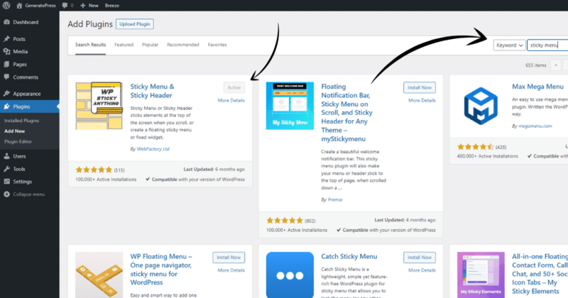
Install this Sticky Menu & Sticky Header plugin from the WordPress plugin repository. The easiest way to do this is from your WordPress dashboard by navigating to Plugins > Add New and searching “sticky menu” in the search bar.
Click Install Now, and then Activate.
Step 2 – Add Header Class
For GeneratePress, the header class is .site-header, so this is what we'll add to the Sticky Element (required) box.
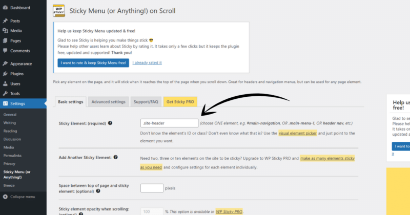
Now, just scroll down and click Save, and voila! Your GeneratePress sticky header should now be working. And if this doesn't do it for you, maybe the next plugin will.
Plugin Option 2 – Mobile Slideout Menu
The Mobilize plugin for WordPress creates a mobile slideout menu that works out of the box. Once you activate Mobilize, you'll have a nifty slideout menu for mobile devices!
This option is great for tall menus, but there aren't many customization options. However, we can make it shine with a little CSS. Sorry, this is more of a Plugin + CSS option.
After you install Mobilize, add the following CSS to your GeneratePress theme:
/*Mobile Only*/
@media (max-width: 480px)
{
    /*Remove GP Menu*/
    .main-navigation
    {
	display: none !important;
    }
    /*Center Menu Text*/
    .mobilize-nav a
    {
        display: flex !important;
        align-items: center !important;
        justify-content: center !important;
    }
    /*Increase Menu Transition Speed*/
    #mobilize-menu
    {
	transition: 300ms !important;
    }
    /*Removes Menu Accent*/
    #mobilize-menu:before
    {
	display: none;
    }
    /*Style Close Button*/
    #mobilize-menu > section > a
    {
	font-size: 18px;
	font-weight: bold;
	padding-left: 70%;
	margin-bottom: 35px;
    }
    /*Change Menu Padding*/
    .mobilize-menu-content
    {
	padding: 25px !important;
    }
    /*Menu Styling*/
    .menu-item a
    {
        font-size: 20px!important;
 	line-height: 1 !important;
     }
    /*Menu Styling*/
    .menu-item ul li
     {
        margin-bottom: 20px;
     }
    /*Menu Styling*/
    .menu-item ul
     {
        margin-top: 20px;
     }
    /*Remove Scrollbar BG*/
    .mobilize-menu-content::-webkit-scrollbar-track
    {
         background-color: transparent !important;
    }
    /*Change Scrollbar Color*/
    .mobilize-menu-content::-webkit-scrollbar-thumb
    {
        background-color: white;
    }
}
Make sure to match the mobile breakpoint in your CSS to the breakpoint in the Mobilize settings. Refer to the image below:
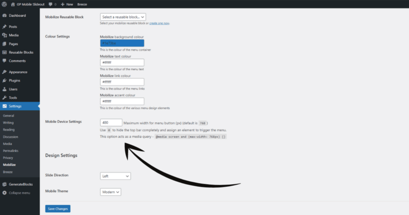
Well, there you have it, 7 total FREE GeneratePress sticky header solutions. If that doesn't do it for you, then I HIGHLY suggest GP Premium.
GeneratePress Sticky Header – Premium
If you already have GeneratePress Premium, here is how to activate the sticky header feature through the Menu Plus module.
Method 3 – Premium
Step 1 – Enable Menu Plus
From your WordPress dashboard, navigate to Appearance > GeneratePress and Activate the Menu Plus module.
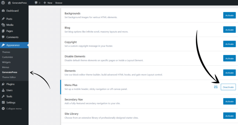
Step 2 – Enable Sticky Navigation
From the GeneratePress customizer menu, navigate to Layout > Sticky Navigation.
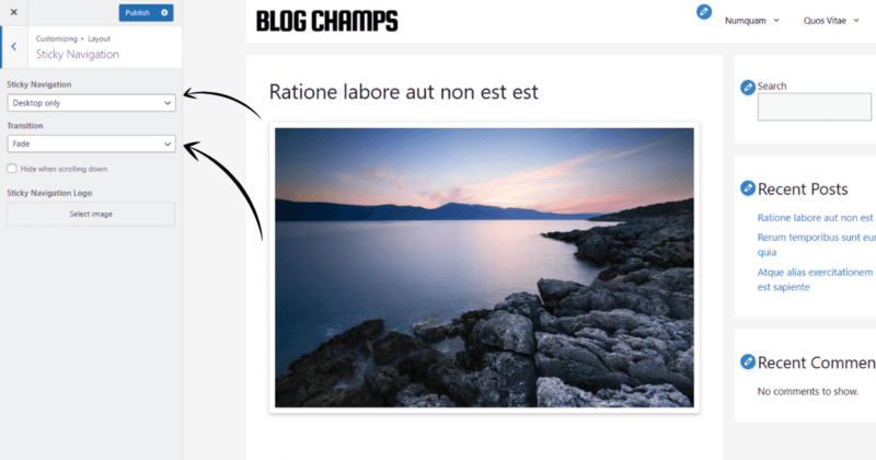
From here, you have a few options to choose from:
Sticky Navigation: Enable sticky navigation for desktop-only, mobile-only, or both (on).
Transition: This is the navigation effect used when scrolling down a page. You can choose from the fade effect, slide effect, or none.
Hide when scrolling down: Enable this to hide the navigation when scrolling down. This helps keep the reading area visible and is really helpful on smaller screens!
Step 3 – Set Navigation Location
Now all you need to do is set the location for your navigation menu. From the customizer menu, navigate to Layout > Primary Navigation, and select the location from the Navigation Location dropdown.
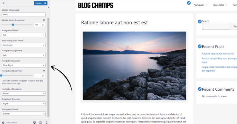
Step 4 (optional) – Use navigation as Header
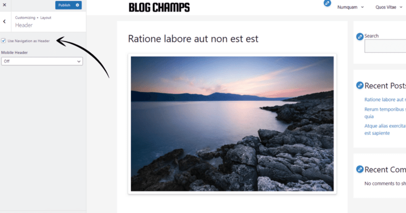
Essentially, this allows you to add your header logo to the navigation menu. To do this, navigate to Layout > Header and click Use Navigation as Header.
Which Method is Best?
It all depends on your individual needs/wants/requirements.
Method 1: This method is hands-down the best choice for those concerned about their website's performance. It adds virtually zero site drag.
Method 2: This is easy for those unwilling to use CSS, but it also provides convenient options not easily achieved through CSS, making it slightly more convenient.
Method 3: Of course, if you already have GeneratePress Premium, this is the best choice because you don't need to mess with CSS or additional plugins.
It's also the best choice if you don't already have GP Premium because you'll get a huge array of additional features besides a sticky header.
Considering GeneratePress Premium?
Many features of GP Premium can be achieved through CSS; however, there is a LOT that cannot. For instance, CSS alone cannot mimic the highly robust block-based theme editor that blows Elementor away! I do recommend it.
Conclusion
To recap, the 3 methods for creating a GeneratePress sticky header :
- Using pure CSS code (4 solutions)
- Using 3rd-party plugins
- Using the Menu Plus module in GP Premium
Hopefully, I was able to provide some workable solutions for you'll! Thanks for reading. Let me know if you have any questions in the comments below. I'm sure I messed something up somewhere!
Thank for the brief content, I really appreciate it.
Thank you for your good solutions!
How fo fix with CSS Solution 2 – Full Header With Scrolling show only mobile version ?
Hey Tony,
Thanks for the comment. I’m not sure I completely understand your question, though. Can you clarify?
Hello Kyle,
With CSS Solution 1 – Full Header and Solution 2 – Full Header With Scrolling are working for my website, but I want it fixed on the mobile version, and I have no need for the desktop version.
So can you help me send custom CSS for this case?
Thank you for your help.
Just omit the tablet and desktop @media queries and use the mobile @media query (max screen size 480px, for example). Wrap whatever CSS you want for mobile only in that.
Here is solution 2 (full header with scrolling) for mobile only. Desktops and tablets will be unaffected.
/*Adjust Mobile Padding*/
@media (max-width: 480px)
{
/*Make Header Sticky*/
.site-header /*header class*/
{
position: fixed;
top: 0;
width: 100%;
max-width: 100% !important;
z-index: 9999!important;
}
/*Scrolling Menu*/
.menu-item ul
{
height: 150px!important;
overflow: scroll!important;
}
/*Page Featured Image*/
.page-header-image
{
padding-top:100px!important;
}
.home,.single-post
{
margin-top: 60px;
}
}
Nice, very helpfull.
Thank you so much.