Are you having issues with GeneratePress mobile menu padding?
In this GeneratePress tutorial, you will learn how to find the correct CSS class for styling the mobile menu, and how to style the mobile menu's padding. If that sounds good to you, then let's begin.
GeneratePress Mobile Menu Padding – Free Solution
For the free solution, we're going to create a custom CSS snippet that can be added to GeneratePress which can be adjusted to your needs. The first step is grasping CSS breakpoints.
Understanding Breakpoints
A CSS breakpoint is a point at which the website content responds based on the device width, allowing you to present the most appropriate layout. This is important to understand as the free solution for adjusting menu padding will require using the @media query to set different CSS styles at different breakpoints.
So, to begin, the CSS snippet looks like this:
/*Addjust Desktop Padding*/
@media (min-width: 768px)
{

}
/*Addjust Tablet Padding*/
@media (min-width: 481px) and (max-width: 767px)
{

}
/*Addjust Mobile Padding*/
@media (max-width: 480px)
{

}
As you can see, I'm using the @media query to set the breakpoints for specific screen sizes, which will allow you to adjust the GeneratePress mobile menu padding independently of larger screens.
Finding the Mobile Menu Class
We need to define the menu class in GeneratePress. There are 2 methods you can use to achieve this.
Google Extension
You can use the CSS Peeper Chrome extension. For this method, you install the extension, open it up, and click on the menu element you want to style.
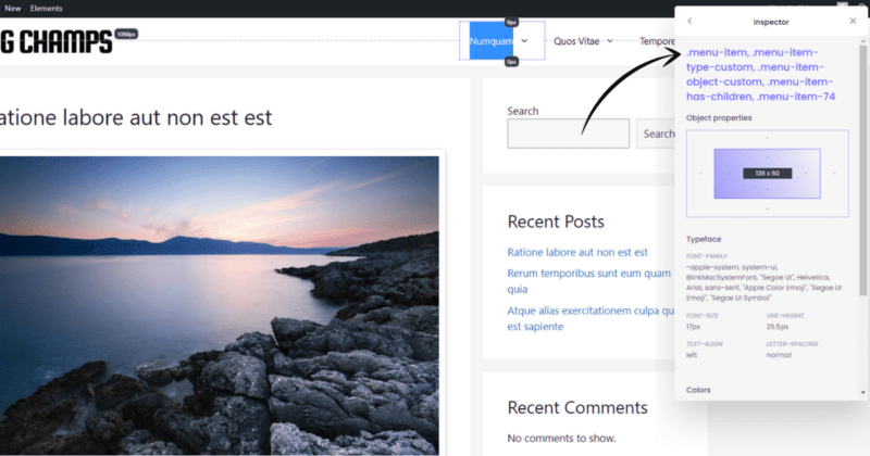
Note, you may have to click the element several times until CSS Peeper lands on the element that you want. After clicking the menu button a few times, I found the class I was looking for. In this case, it's .menu-item.
Right-click Inspect
You can also right-click the menu element you want to style and search for the class in the dev tools panel. This is what I do most of the time, and it works for me.
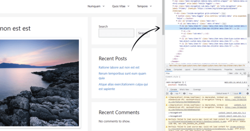
You can always check to see if you have the right class by setting the properties' display value to none, and if it disappears, you have the right class.
.menu-item
{
    display: none;
}
Now that we have our class, it's time to define its properties.
Defining CSS Properties
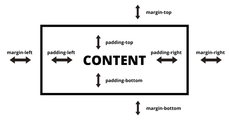
To adjust the space around our menu content, we'll use the padding CSS property, and we'll use the margin CSS property to define the space around the menu borders. To understand how these properties work, refer to the image below.
Okay, let's put it all together now.
Putting It All Together
There are a few ways you can pad your mobile menu.
Adding Outside Spacing
You can pad the menu button within the main navigation, creating a padded area between the button and the main navigation class.
.menu-item
{
    padding-top: 10px;
}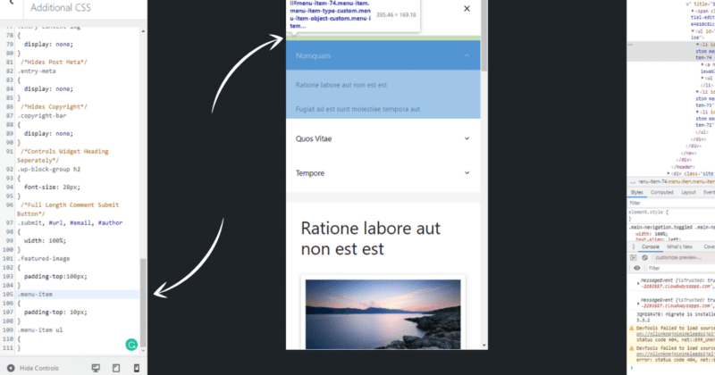
Notice that green bar? That's the top padding on the .menu-item class generated from the padding-top property. This essentially lowers each menu button.
The problem we run into here is that each sub-menu button will inherit the padding property because they are children of the .menu-item class. A workaround for this is to override the sub-menu buttons with their own padding using .menu-item li. For example:
.menu-item
{
    padding-top: 10px;
}
.menu-item li
{
    padding-top: 0px !important;
}
The above code allows you to assign different padding values for both the top-level and sub-level menu buttons. It's also important to make sure the child element is underneath the parent element.
Or you can utilize the not pseudo-class, like so:
.menu-item:not(.menu-item li)
{
    padding-top: 10px;
}
The above code allows you to pad the top-level menu buttons independently of the sub-level menu buttons. This is helpful if you only want to pad the top-level buttons and not the sub-level.
Adding Inside Spacing
You can also pad the content within the menu button, which essentially creates a larger button. For example:
.menu-item a
{
    padding-top: 10px;
    padding-bottom: 10px;
}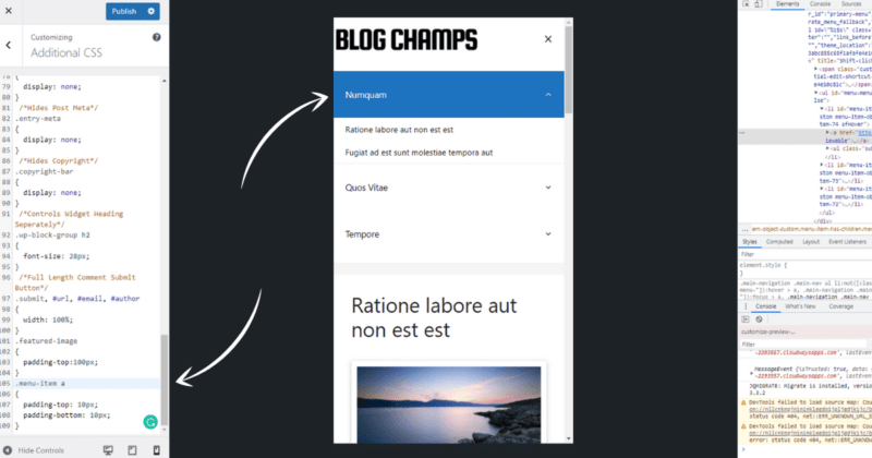
Notice, we don't have the same problem as before because .menu-item a isn't a parent of the sub-menu buttons. The sub-menu buttons can be styled independently by targeting them with .menu-item ul li, like so:
.menu-item a
{
    padding-top: 10px;
    padding-bottom: 10px;
}
.menu-item li a
{
    padding-top: 20px!important;
    padding-bottom: 20px!important;
}
If you're a perfectionist like me, you'll notice another problem here. In the above example, you will get 20px above and 20px below, but 40px in the middle. That just won't do! It's not even! To fix this we'll only add top padding to each sub-menu button and add the same padding to the bottom of the list as a whole. For example:
.menu-item a
{
    padding-top: 10px;
    padding-bottom: 10px;
}
.menu-item li a
{
    padding-top: 20px!important;
}
.menu-item ul a
{
    padding-bottom: 20px!important;
}
Alright, now we have an evenly padded menu! The final CSS snippet now looks like this:
/*Adjust Desktop Styling*/
@media (min-width: 768px)
{

}
/*Adjust Tablet Styling*/
@media (min-width: 481px) and (max-width: 767px)
{

}
/*Adjust Mobile Styling*/
@media (max-width: 480px)
{
    .menu-item a
    {
        padding-top: 10px;
        padding-bottom: 10px;
    }
    .menu-item li a
    {
        padding-top: 20px!important;
    }
    .menu-item ul a
    {
        padding-bottom: 20px!important;
    }
}
You can use the same classes and properties across all breakpoints to adjust them independently of each other if you wish, but since we're talking about the mobile menu, I've only added it there.
Adding Additional CSS
Now that you have your CSS snippet, all you need to do is copy it and add it to GeneratePress' Additional CSS field from the customizer menu.
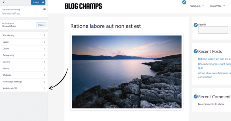
After you add the CSS snippet, adjust the values until you like what you see, and click Publish, and you're done!
GeneratePress Mobile Menu Padding – Premium Solution
If you already have GeneratePress Premium then you're in luck because GeneratePress has built-in options for this! Yup, this is the only theme I've ever seen with options for this in the customizer menu. To adjust the mobile menu padding, follow these steps:
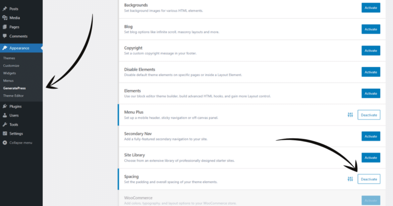
1. From the WordPress dashboard, navigate to Appearance > GeneratePress and enable the Spacing module.
2. From the GeneratePress customizer menu, navigate to Layout > Primary Navigation to adjust the menu padding options.
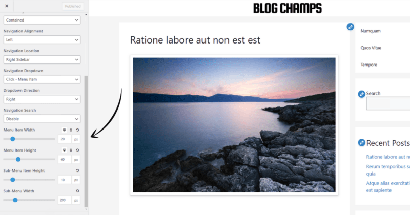
As you can see, GeneratePress has included options for adjusting the height and width for both desktop and mobile devices in the customizer menu. Nice!
Other Reasons for GeneratePress Premium
If you haven't already upgraded to premium, no worries! A lot of the premium features can be achieved through CSS. However, there is also a lot that CSS alone can't mimic or would at least require a Ph.D. in programming and theme design.
For example, with GeneratePress Premium you get access to the block-based theme builder module allowing you complete layout control. Check it out in the video below:
Additionally, you get access to their entire site library, allowing you to easily develop or change websites. You'll also get access to an extensive array of modules designed to make customizing GeneratePress a breeze.
Conclusion
Adjusting the GeneratePress mobile menu padding is pretty simple. It's as easy as:
- Finding the menu class, .menu-item
- Styling them with the padding property
- Using the @media query to apply adjustments to mobile only
If you have any questions or just wondering why I talked so damn much about padding a WordPress menu, let me know in the comments below!
Thank you.
